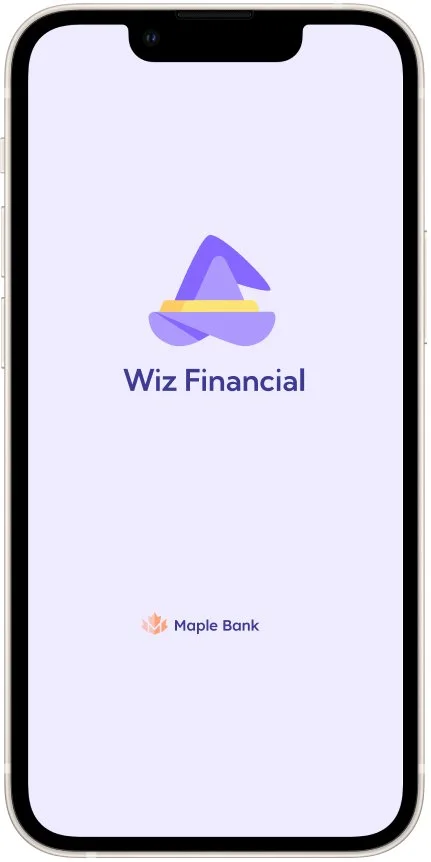
Financial Mobile App
How to become a financial wizard
How can we empower young individuals to manage their economic resources effectively and take control of their financial future?
OBJECTIVE
The project aimed to develop an app to empower young individuals to manage their economic resources effectively and take control of their financial future.
The goal was to provide a seamless onboarding experience while using UX design techniques to address this challenge and meet the needs of both Maple Bank and its customers.
SOLUTION
Developing a user-friendly budgeting and financial literacy app with personalized goals and reminders can effectively address financial illiteracy among younger users and open new market opportunities.
ROLE
UX/UI Lead
TIMELINE
3 weeks
TOOLS
Figma, Miro, dovetail
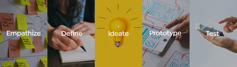
DESIGN THINKING PROCESS
⬇︎
EMPATHIZE
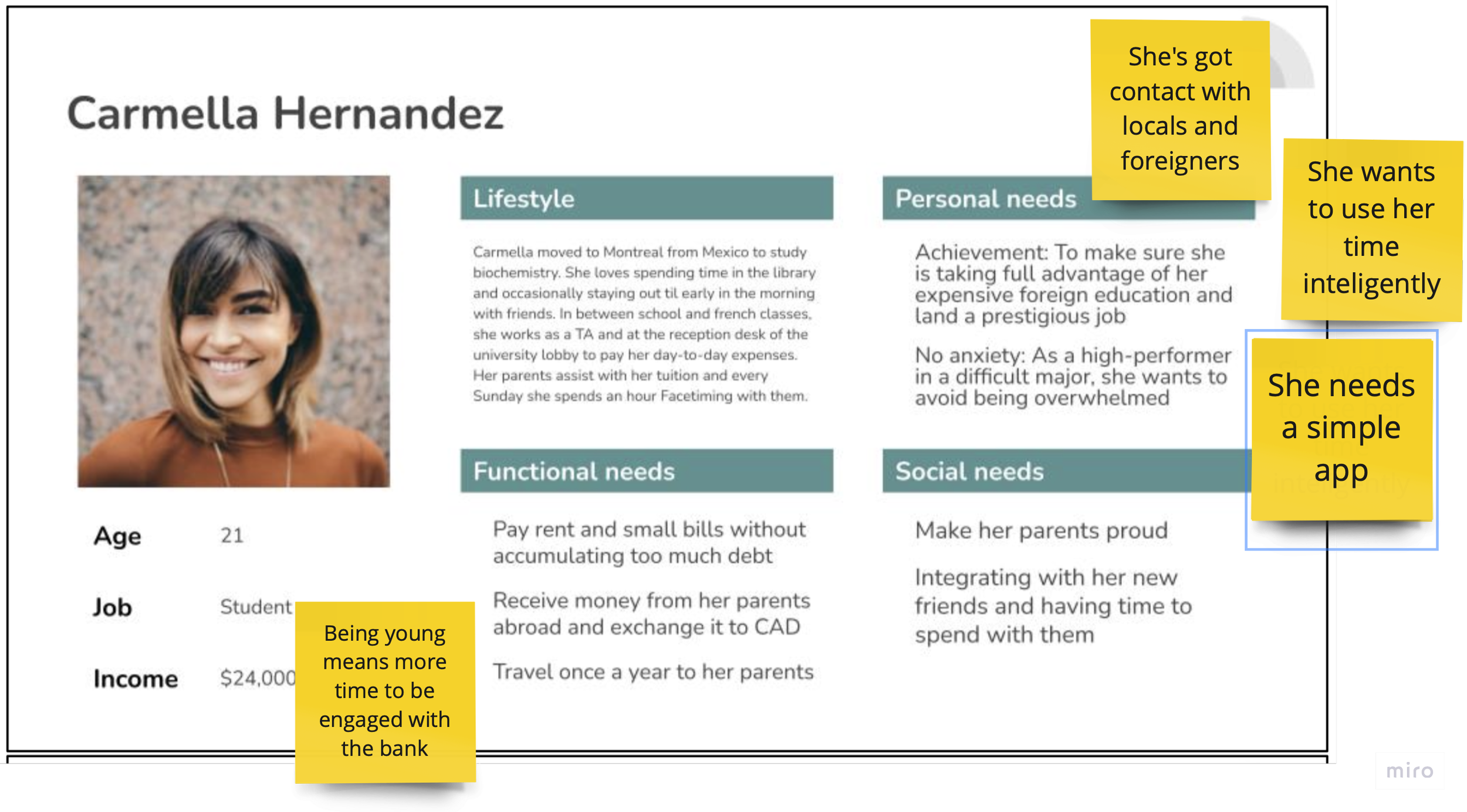
PERSONA AND TARGET AUDIENCE

After conducting brainstorming sessions and initial research, our team identified young adults lacking financial knowledge as our target audience. We selected Carmella, an international student from Mexico studying in Montreal, as our representative.
Carmella values time management and maintains a strong social network. Her goals are saving money and avoiding debt. With ample time to engage with the bank, she has the potential to develop healthy financial habits and become a long-term client.
USER SURVEYS AND INTERVIEWS
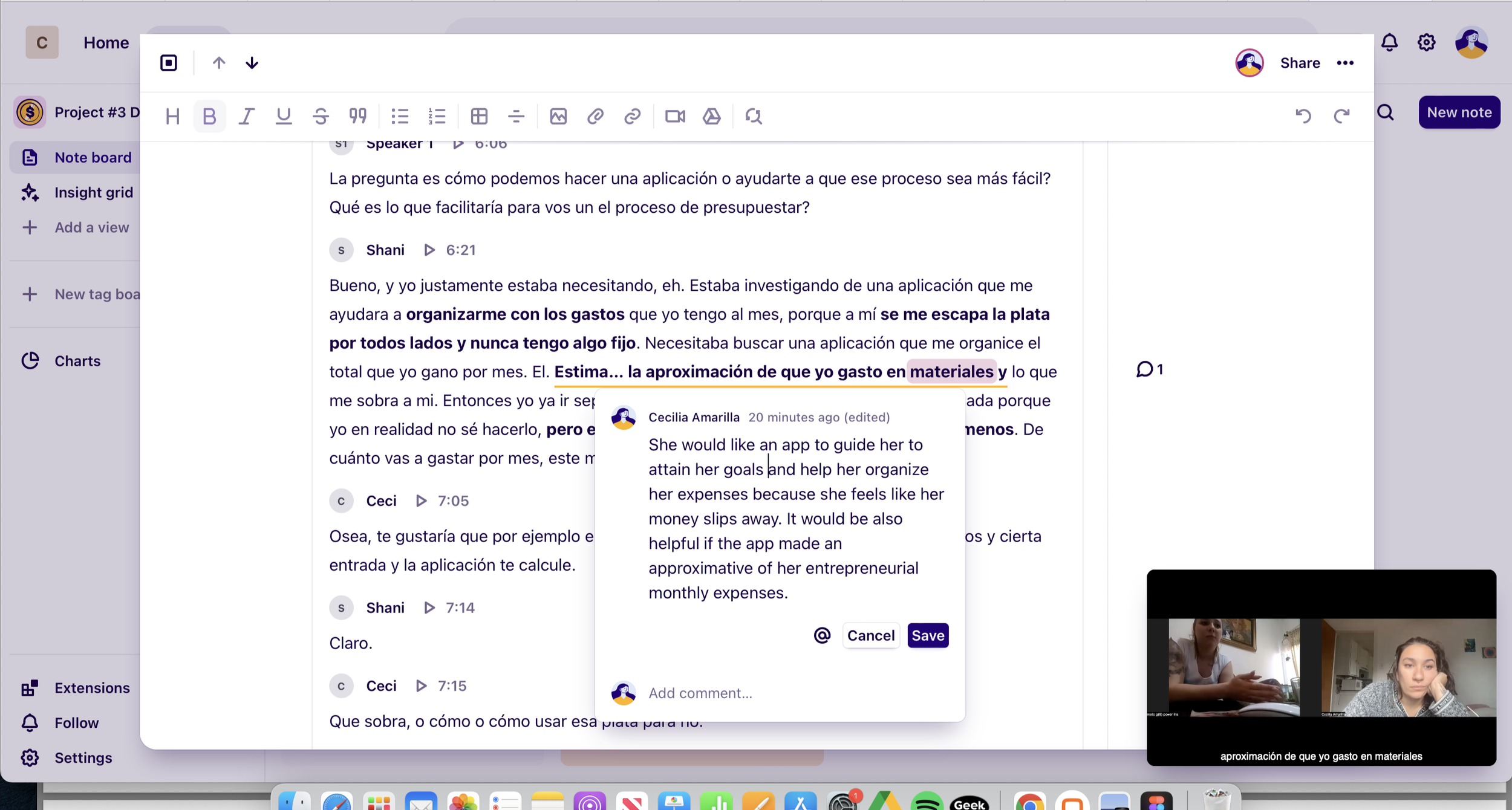
I conducted three interviews, and utilized Dovetail app to seamlessly analyze, synthesize, store, and share my research findings in a single, collaborative, and easily searchable platform. I gained the following 5 insights:
Difficulty tracking money: Some users find it challenging to keep track of their finances.
Negative online banking experiences: Many users have had unfavorable experiences with online banking.
App flow issues: Users encounter problems with the app flow and may not fully understand their options.
Preference for human interaction: Some users prefer human interaction over relying solely on technology for their banking needs.
Untapped opportunities: Users tend to limit their app usage to salaries and debit, missing out on other opportunities
EMPATHY MAPPING AND JOURNEY MAPPING
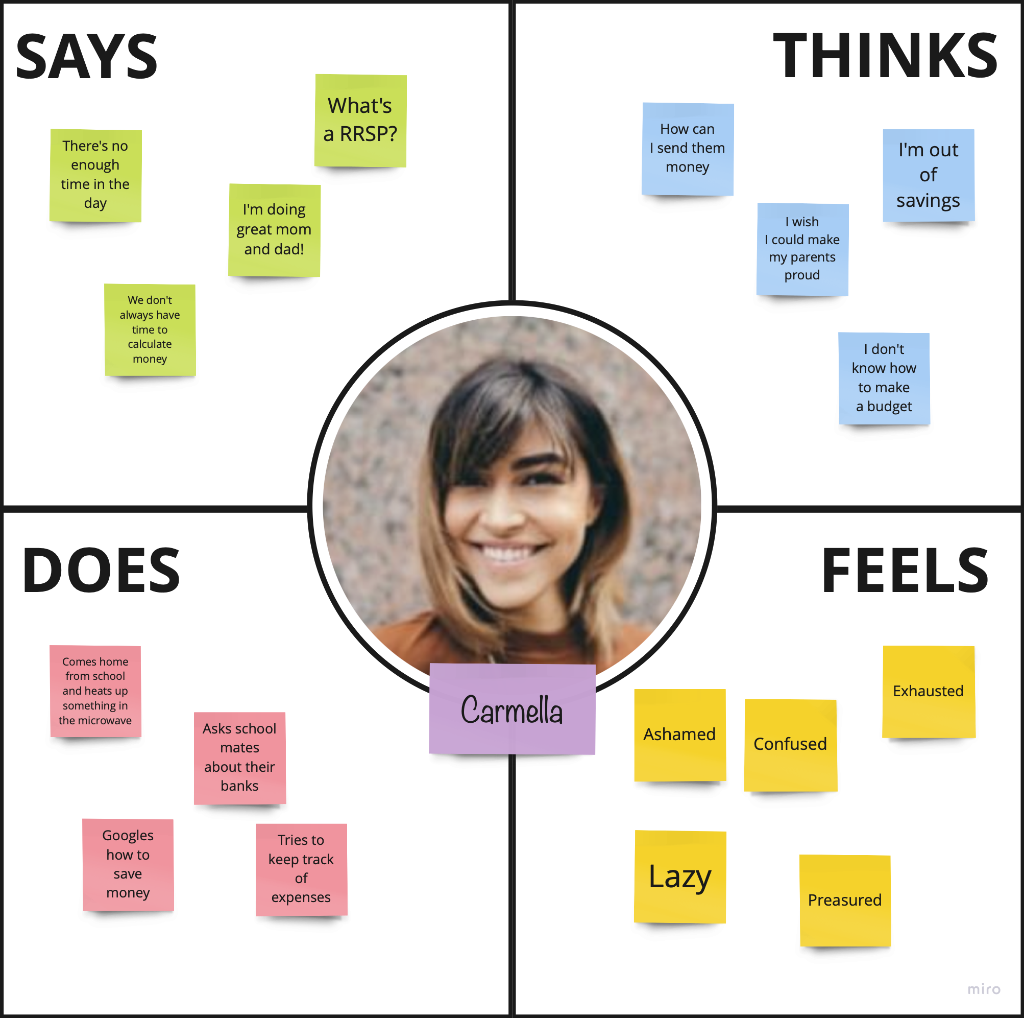
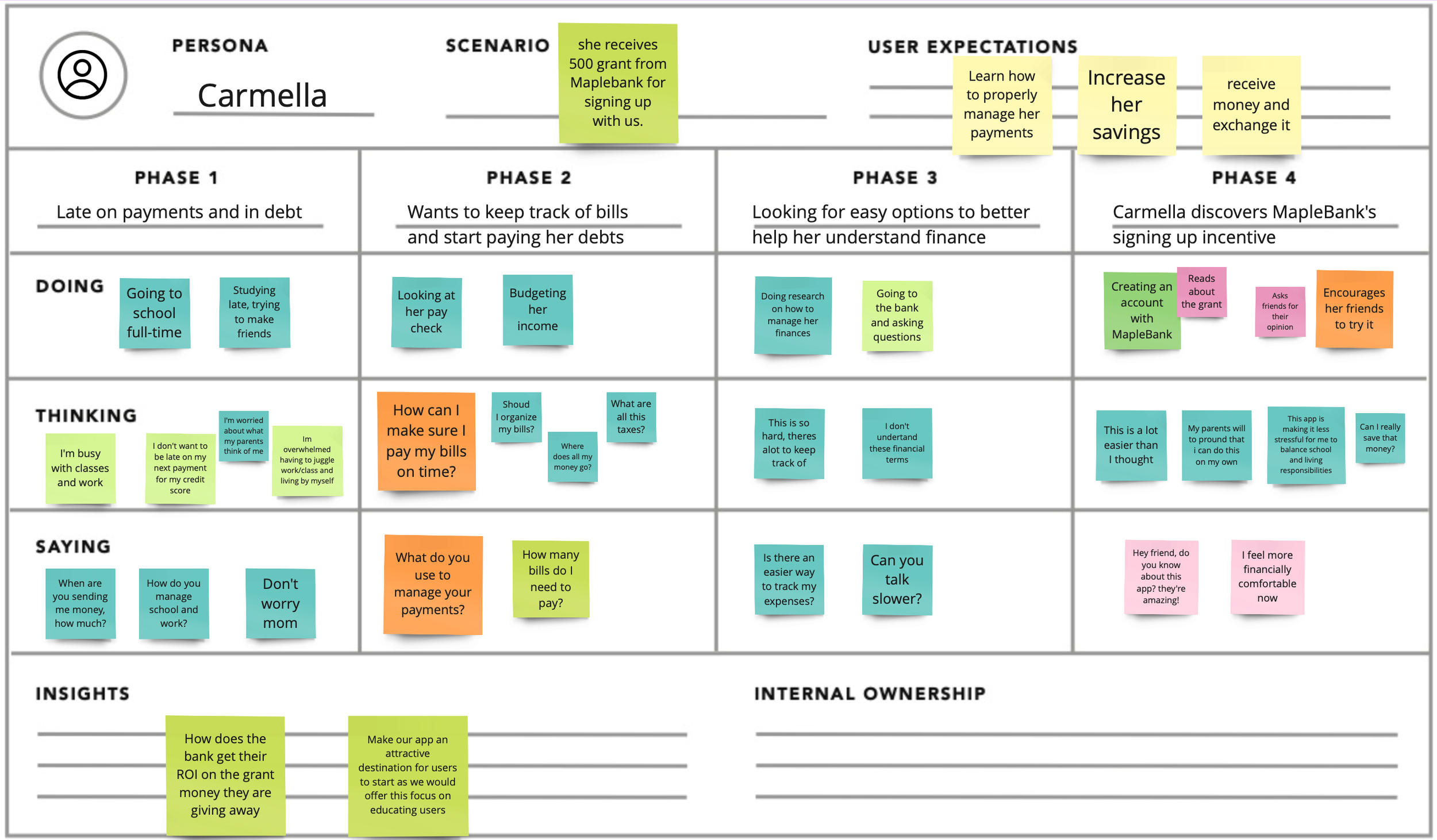
By employing empathy and journey mapping techniques, we gain a deep understanding of Carmella's behaviors, needs, and pain points in her banking experience. This allows us to design tailored solutions that streamline her financial journey, offer educational support, and address her specific requirements as an international student. The insights highlight the importance of a smooth onboarding process, user-friendly daily banking tasks, personalized savings tools, and comprehensive financial education, guiding the bank to better serve Carmella and similar customers.
DEFINE
COMPETITOR ANALYSIS
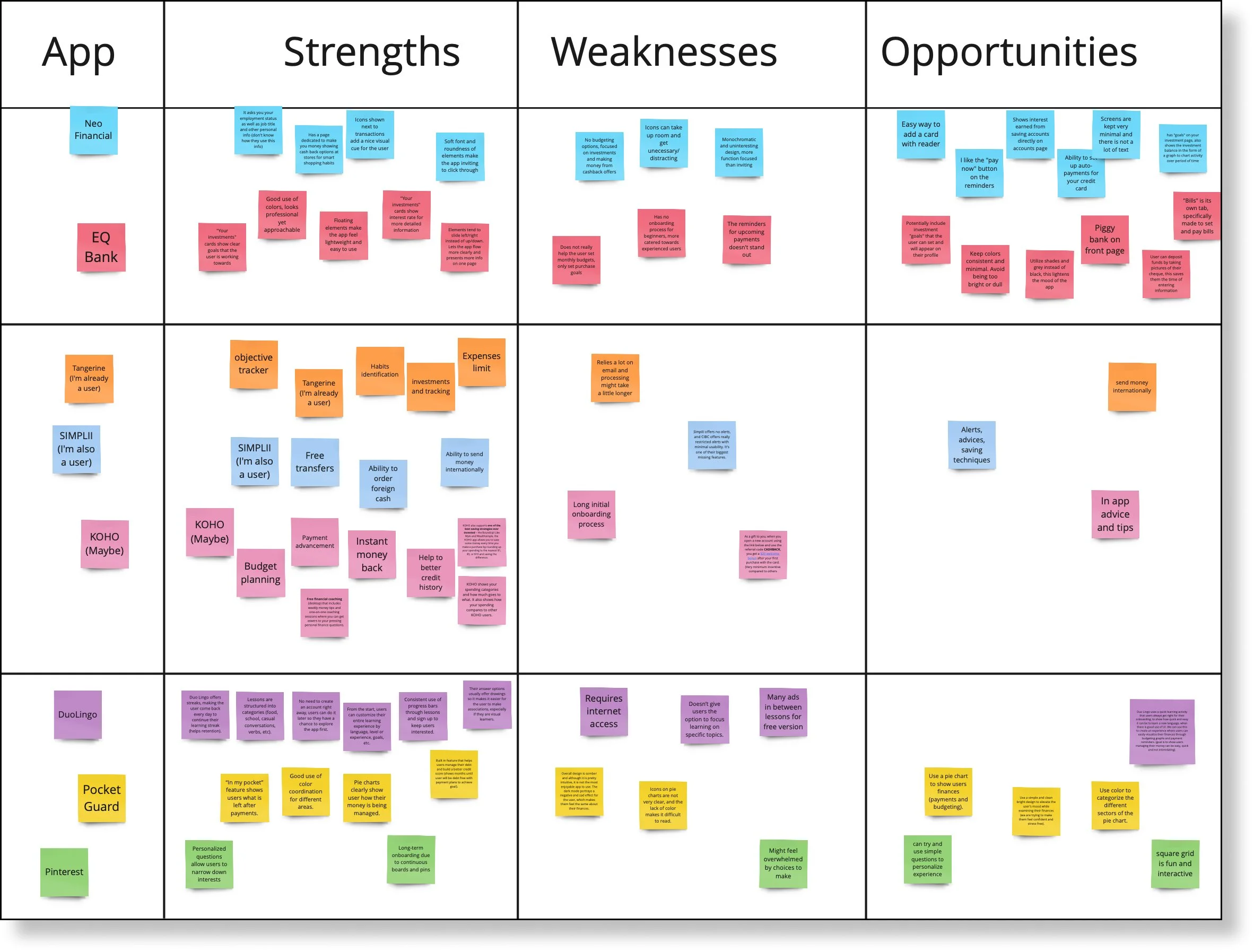
My team analyzed direct and indirect competitors in the neo-banking industry and studied apps like Duo-Lingo and Pinterest for onboarding insights. Some other examples were Tangerine, Simplii Financial, and KOHO, Neo Financial and Pocket Guard.
Opportunities found
Prompts/questions allow the onboarding experience to feel more personalized to the user.
Interactive elements such as shapes, icons and animations keep user engaged (but must be used carefully).
What to Avoid
Asking for too much information at once
Overwhelm the user with too many options or features
Abandon users without any support or assistance.
Busy and preoccupied users who lack financial knowledge tend to be intimidated by personal banking and finances.
~
How might we…
Design a product with seamless and intuitive on-boarding flow that will help new users, especially younger demographics, create healthy habits and learn about their finances?
IDEATION
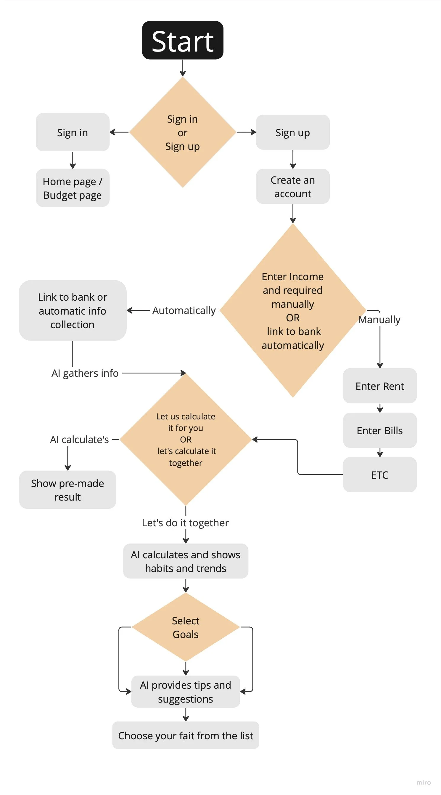
USER FLOW
Onboarding:
User downloads and installs the app.
User creates an account or signs up using an existing account.
User provides necessary information like name, email, and password.
If it’s the user’s first time they need to: Enter Income and bank information, they can do this automatically or manually.
Homepage:
User lands on the app's homepage after logging in.
User is greeted with a personalized dashboard that provides an overview of their financial status, goals, or recent activities.
User can easily navigate to different sections of the app.
Here they have an option to calculate their budgets by themselves or to let us do it for them.
Goal Setting:
User sets financial goals (e.g., saving for a vacation, paying off debt) within the app.
User can define the target amount, timeline, and specific actions required to achieve each goal.
User receives reminders, progress updates, and tips to stay on track towards their goals.
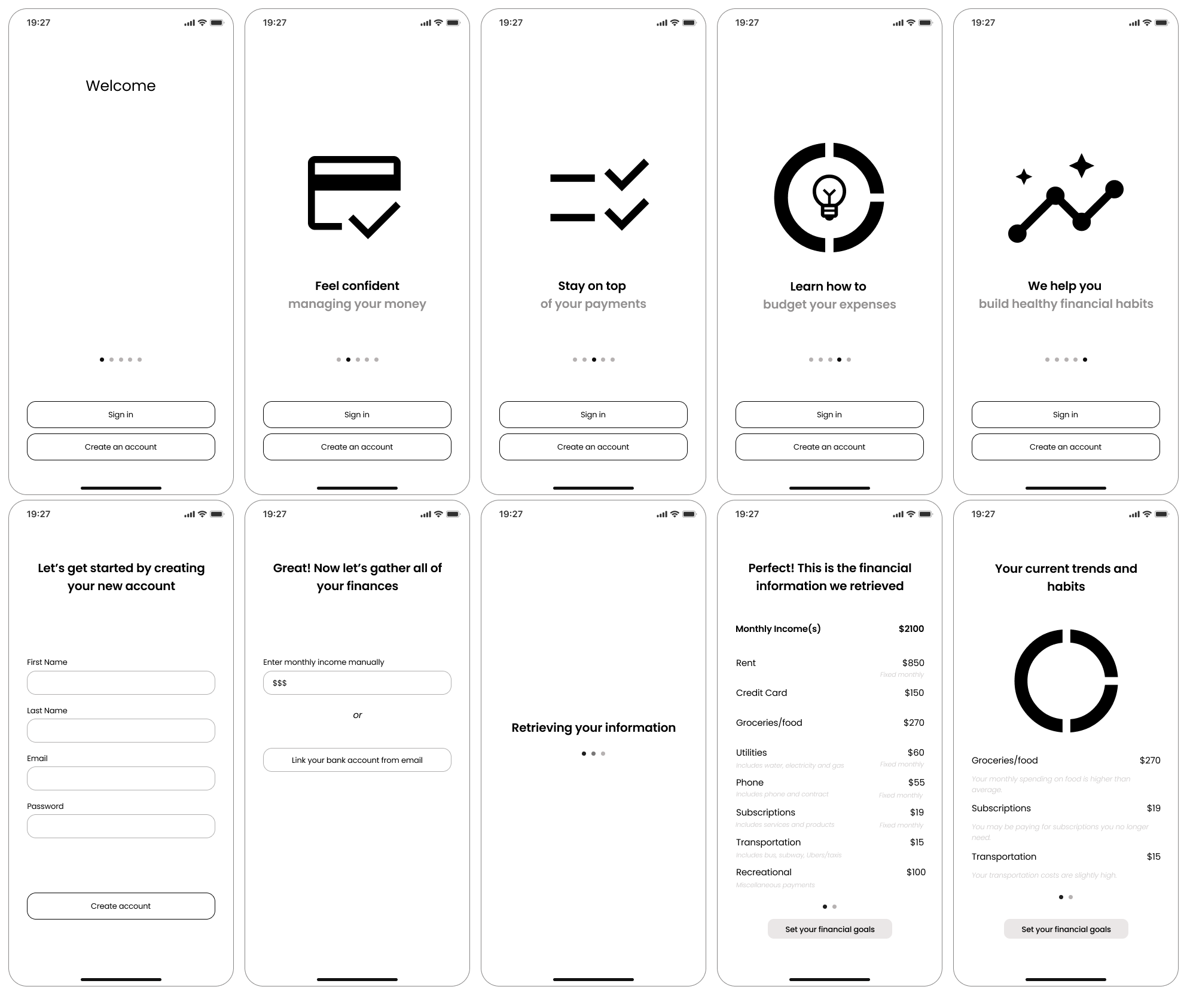
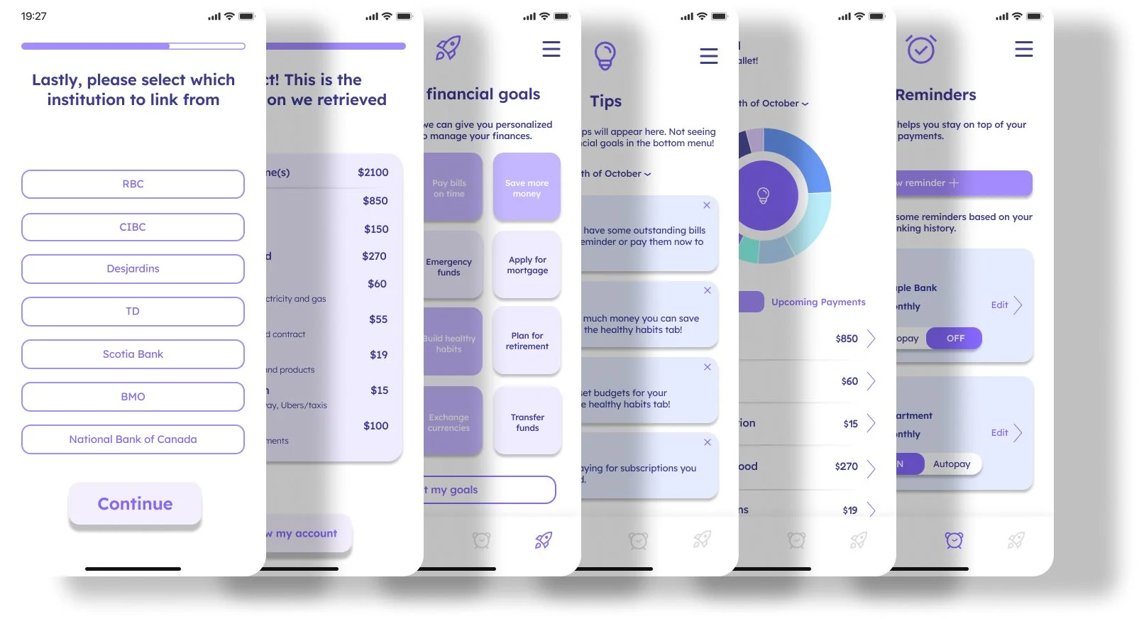
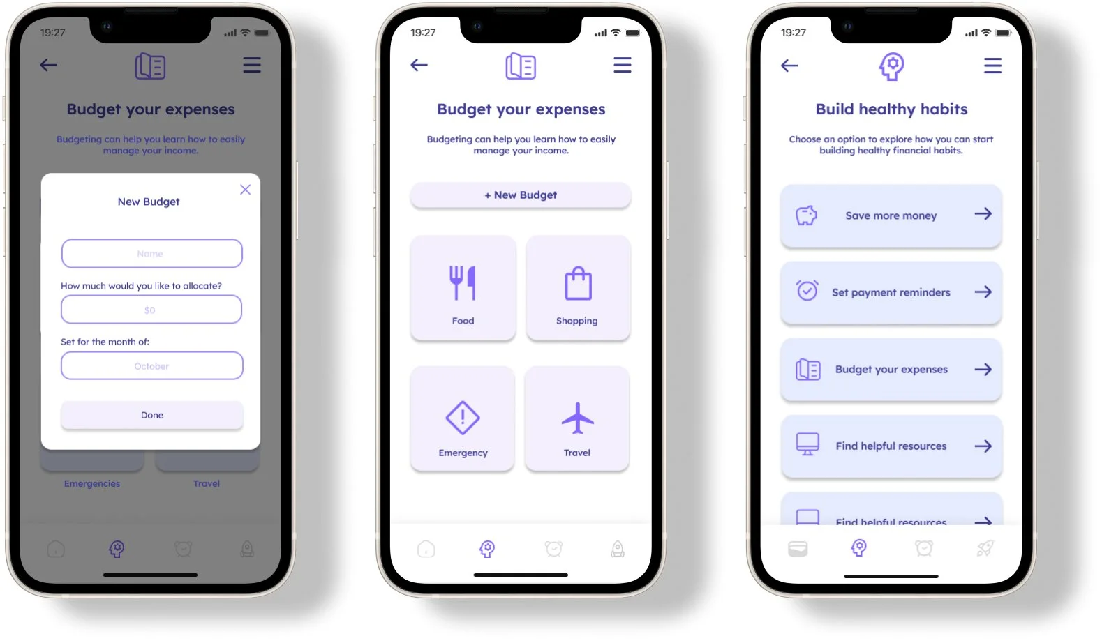
LO-FI WIREFRAMES
We established a set of prioritized features for our new app and moved on to sketching low fidelity wireframes.
Beginning with the onboarding flow and the gathering of personal information, we made sure to keep accessibility in mind while addressing the main issue at hand, create healthy financial habits.
We collaborated on sketches and developed screens for several key features, including Reminders, Save Money Calculator, Tips, Goals, and Budgeting.
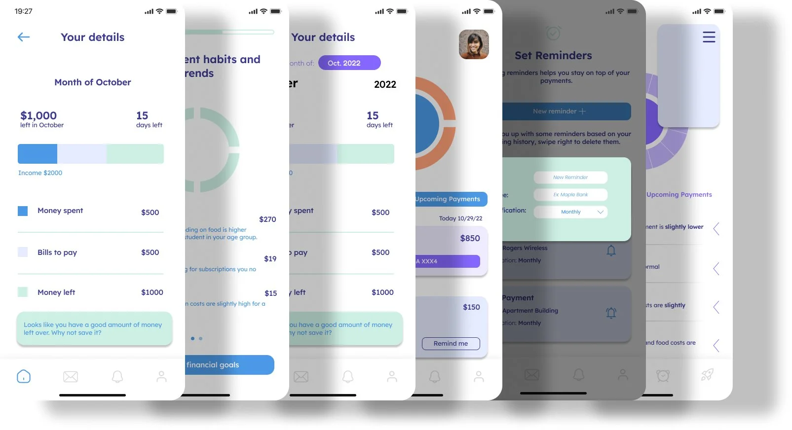
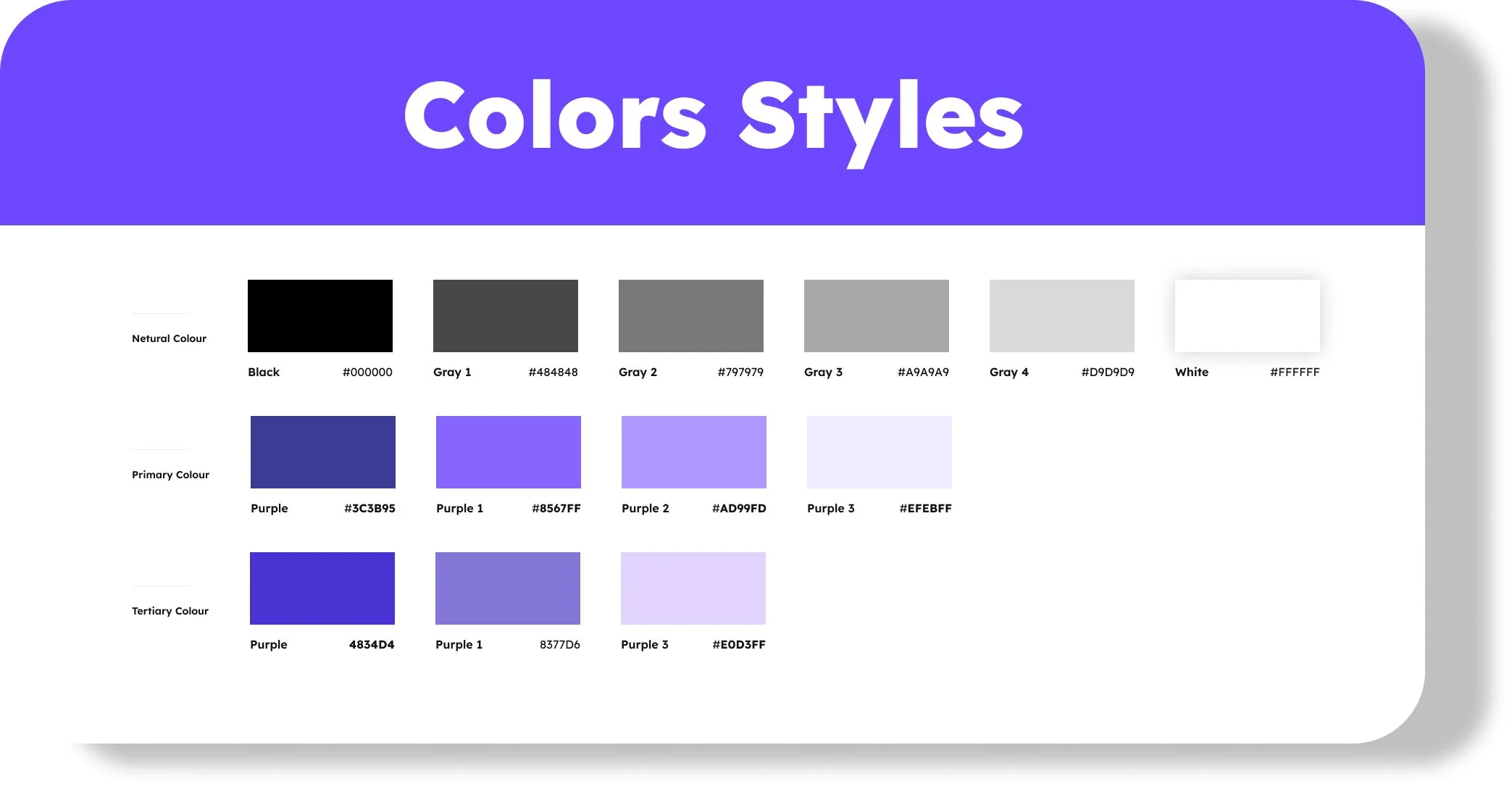
HI-FI WIREFRAMES - Color schemes, Palettes, and Typography.
These design elements greatly influence how the app is perceived by the intended audience.
For this financial app, the goal was to create trust, calmness, and excitement.
To achieve this, colors associated with trust and stability such as blue, green, and gray were considered. Lighter shades and soft pastel colors were also incorporated to maintain a sense of calmness.
Wireframes were developed and tested with real users to gather feedback.
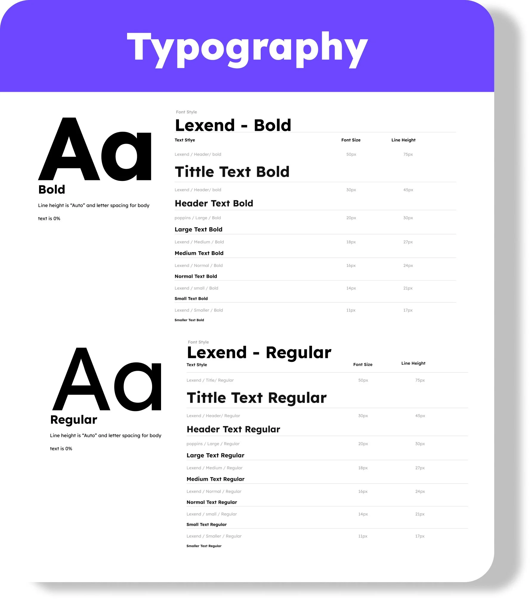
Choosing an easy-to-read font is crucial for mobile apps. Sans-serif fonts like Helvetica or Arial are preferred for their clarity on smaller screens.
The font size and weight were selected based on the target audience. Lexend was chosen as the font, as it combines youthful and exciting feelings with clarity and readability.
In summary, the design choices for this financial mobile app were carefully made to convey trust, calmness, and attractiveness to the young target audience with limited financial literacy.
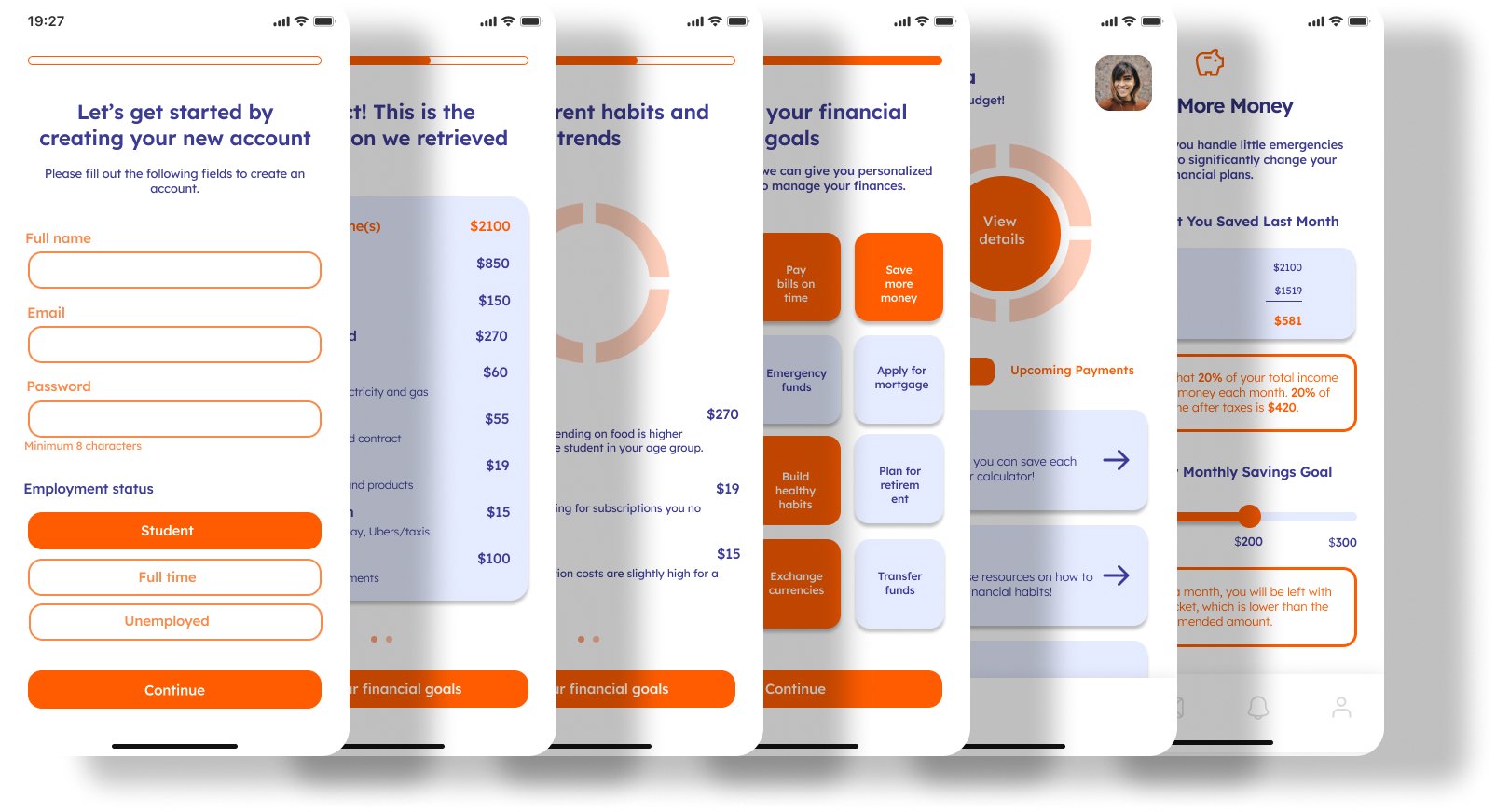
USABILITY TESTING
Was crucial to identify user issues and improvements. Remote tests via Zoom provided valuable feedback on design elements like color schemes and typography.
Based on feedback, a black-to-purple color palette was adopted, considering the psychological effects of colors. Black represents sophistication, while purple evokes creativity and luxury. Shades were chosen to create contrast, visual interest, and maintain a sense of calmness and trust.
Lexend typography was chosen for its youthful and exciting feel, combined with readability. Its unique letter spacing design improves screen reading, ideal for a mobile app.
Overall, the color palette and typography were decided based on usability test feedback and desired emotional response. They will greatly impact the user experience of the financial mobile app.
IDEATE
Enhancing User Interface
I made necessary changes to the initial wireframes and took the lead in designing key components, including buttons and a significant portion of the interactive user interface. My focus was on creating aesthetically pleasing and functional designs that prioritize the user experience. Clear navigation, understandable icons, and intuitive user flows were incorporated. Collaboration with the design team ensured consistency and alignment with the project's vision. Overall, the changes were based on usability test feedback and aimed to deliver an attractive and user-friendly experience.
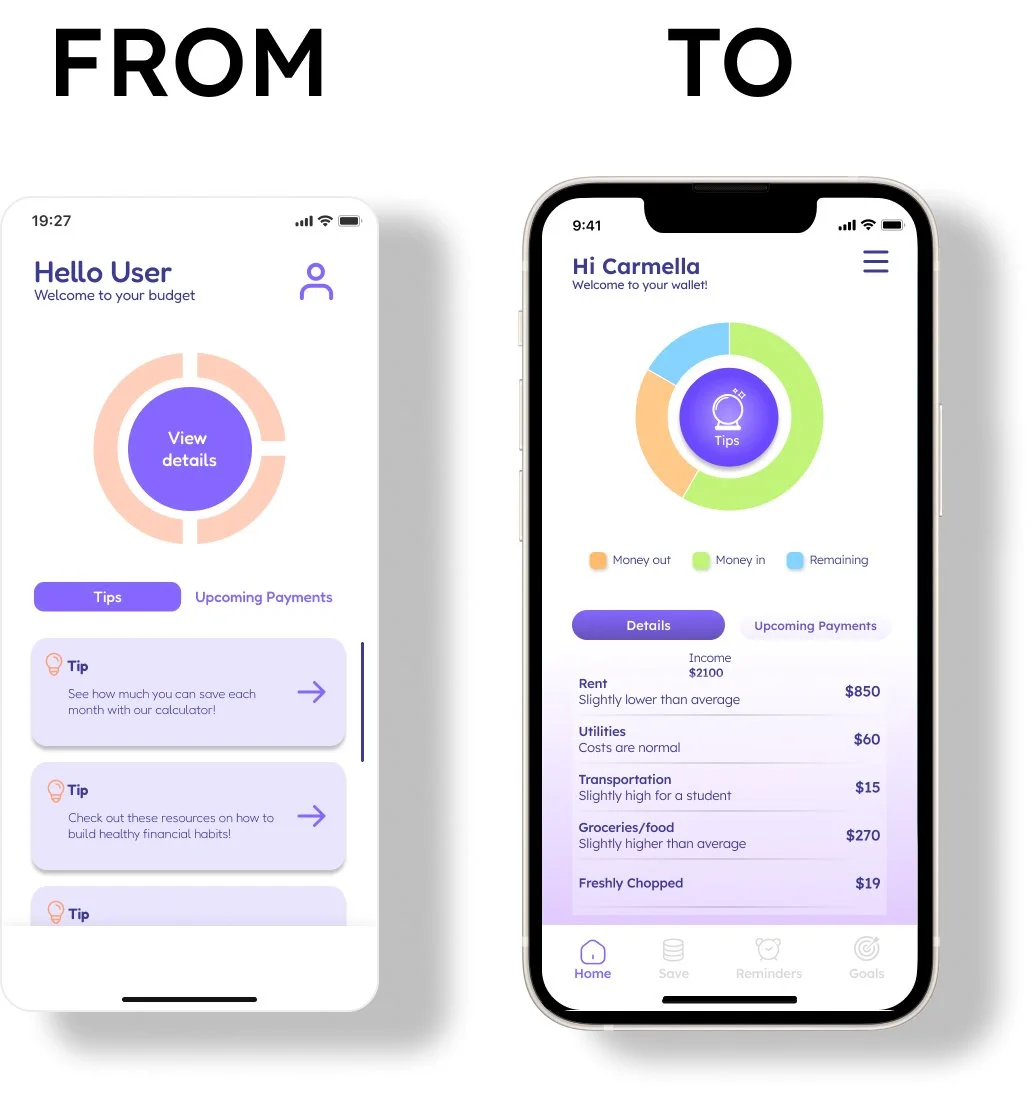
Optimized Interface Design
Feedback on navigation and color palette prompted a reevaluation. We aimed to implement best practices for a user-friendly and visually appealing interface. The result was an intuitive navigation bar and industry-aligned color palette. Overall, feedback led to a more effective design based on existing standards.
"I find the navigation bar icons too confusing, it is difficult to find certain pages."
"The colours are all too similar and the chart is hard to understand"
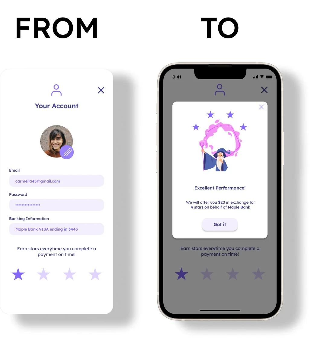
Engaging Reward System
To address low user engagement and lack of immediate value, a reward system was created. Users received incentives for completing tasks and reaching milestones, keeping them engaged and motivated. Rewards included badges, stickers, discounts, and exclusive content. The system successfully improved user engagement and encouraged regular app usage.
"I would like it to have some kind of reward system or feedback to continue using the app"
Iterative Design Improvement
We acknowledged that certain High-Fidelity wireframes fell short of design standards and required improvement. By reviewing usability test feedback and researching best practices, we iterated on design principles to achieve a visually appealing and intuitive design. This experience emphasized the significance of an iterative design approach in meeting user needs and delivering better products.
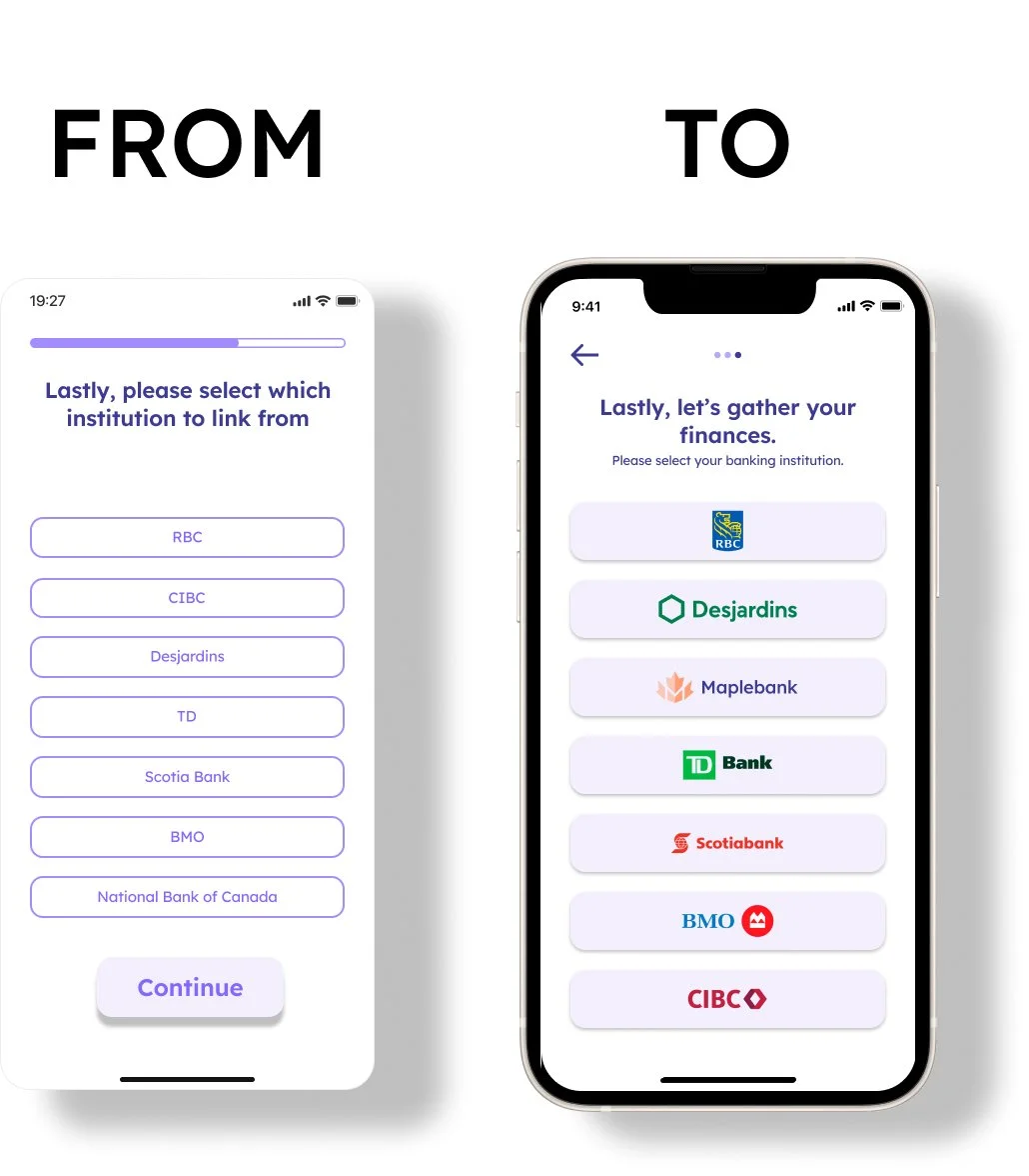
“It would be easier to recognize the bank logos than having to read”
Simplified Features
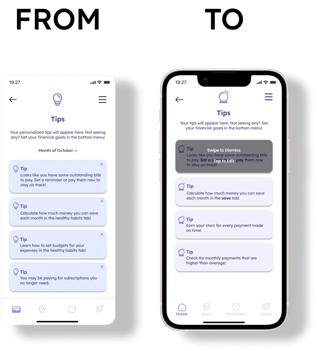
Testing revealed that users did not use the Exit button on each card, opting for intuitive swiping instead.
The month drop-down menu was deemed unnecessary and did not enhance the user experience.
Sometimes, adding more features can hinder usability rather than improve it.
Streamlined Design
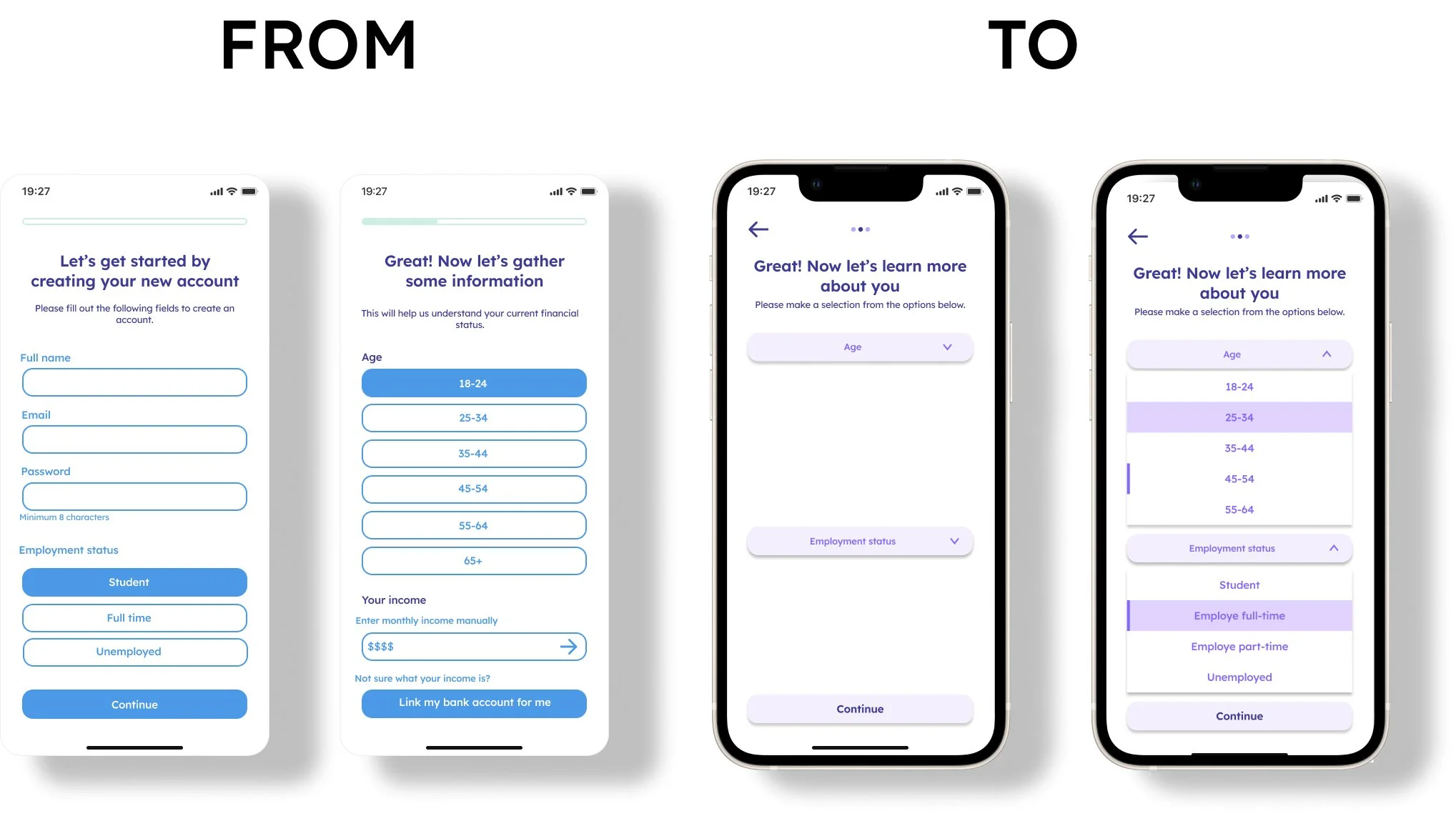
Based on feedback, I redesigned the initial pages to address user concerns about overwhelming and overcrowded content.
By reorganizing and implementing dropdown components, I created a more seamless experience. The use of dropdowns helped maintain a clean and organized interface while providing all necessary information.
This led to improved navigation, increased engagement, and higher customer satisfaction. By prioritizing user needs and simplifying the interface, I enhanced the product's usability and overall user experience.
Prioritizing Essentials
Initially, we received positive feedback, fueling our enthusiasm to explore various design ideas. However, we later realized that some pages and features were non-essential, although they had potential for the future. To prioritize user needs and streamline the design, we decided to discard non-essential elements. This allowed us to create a more user-centric design, resulting in an effective and efficient product.
Through this process, we learned the importance of balancing enthusiasm with practicality and keeping the user as the main focus. Prioritizing user needs and essential elements enabled us to create a more impactful product.
CONCLUSION
In conclusion, our main focus was achieved by creating a smooth flow that boosts user comfort and confidence, fostering exploration and utilization of the app's value. Despite challenges in defining the target user and finding an optimal solution, this project proved rewarding. Our prototype aimed to alleviate stress and anxiety through a personally relatable, seamless, and intuitive user experience. We prioritized a natural, user-friendly, and enjoyable interface, ensuring easy navigation and user confidence. Overall, our goal was to deliver an enjoyable and beneficial experience tailored to user needs.
Try out the interactive prototype and become a financial wizard!
REFLECTING BACK AND TAKEAWAYS
Upon reflecting on my experience, I have realized that a clear understanding of the user persona and their goals is crucial in the design process. I found it challenging to work independently, and I believe that having more input from seasoned UX designers would have been beneficial.
Moreover, this project demonstrated the significant amount of time and effort required to create a functional Minimum Viable Product. In hindsight, I should have allocated more time for testing and validating our design decisions to ensure that we were creating the best possible product for our users.
As I took on the responsibility of being the center of research and leading the usability testing and component design during this project, I have come to the conclusion that pursuing a career in UX design is what I want to do. I plan to take concrete steps towards enhancing my UX design abilities to achieve this goal.